
COURSERA REBRANDING
Role: Product Designer
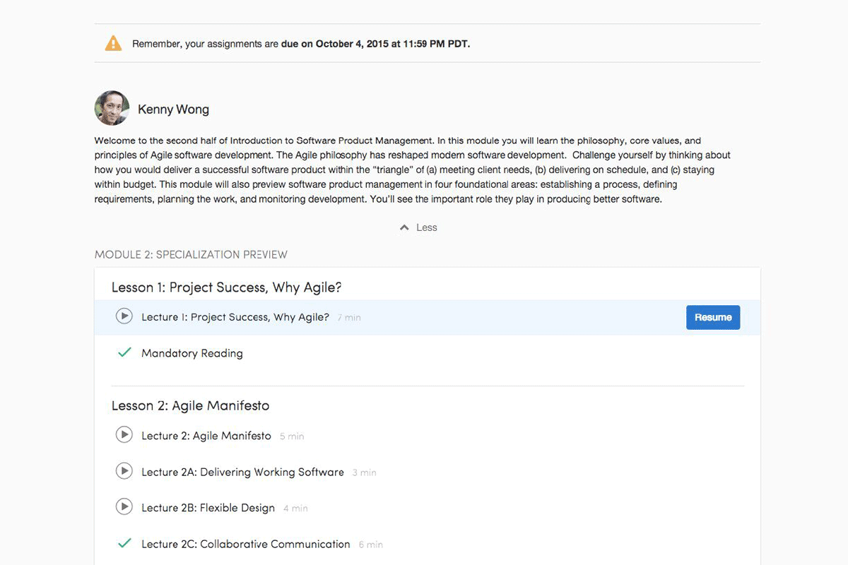
New branded Specialization homepage
As Coursera grew rapidly and expanded its digital campus globally with over 15 million users, the visual identity and design patterns also ran into a challenging scale. Different divisions, features and priorities resulted in a variety of design philosophies and technical structure. A cohesive branding experience and consistent learning quality was urgent.
The comparison between before and after the new cards system and spacing implementation.
The rebranding was more than a face lift. To improve the site performance and production efficiency, the redesign process was essentially changing not only in codes and mocks, but also the communications within and between design and engineering teams.
Design Pattern Library
For a better communication and consistent quality in the design production, we created a master design pattern library for the UI templatization. Amy Weibel (Product & Brand Designer) and I hosted 2 workshops to guide the design team how to best use the design patterns and update the library regularly. The Sketch file was well-symbolized so designers could easily grab-n-go.
Designers Speaking Engineers Language
One of the goals in this project was to sync the communication language between engineers and designers. In other words, designers needed to speak CSS. In addition to the design pattern library, we also created an online style guide which was mapped with CSS classes. Designers could get CSS code directly and note in the mocks. So there was no lost in translation in mocks delivery
Typography
We abandoned Sofia Pro and embraced Merriweather and Open Sans. Both fonts are optimized for the screen display and provide a great variety of font wights. We used Merriweather for the prominent headlines. Open Sans is used for description and paragraph text due to its wide support on languages.
Photo credit: Amy Weibel
Spacing & Margin
Despite the beautiful typography was chosen, the new look wouldn't go anywhere until a key element fixed - spacing & margin. The GIF below shows how little the improvement was when we solely implemented the new fonts.
Before vs After implementing typography only without new spacing
After adding a proper spacing and margin, we could see the dramatic improvement in the layout. See GIF demonstration below.

Phase One Launch
Due to the complexity and huge scale of the project, we needed to sequence the tasks into phases. The engineering team could also benefit from not manually monitoring thousands of coding changes everyday since new projects still kept rolling out simultaneously.
In only 3 sprints of Q4 2015, we launched the phase 1 of the systematic and fundamental structure including typography, color palettes, cards system, spacing, buttons and along with few other UI components. The focused pages were the three main course experience pages: Course homepage, Week page and Assignments Tab. For other pages updates, we decided to turn them into ticket-based task which aligned with AoRs (Areas of Responsibility) model of the team structure.
Before / After - Course homepage
Before / After - Course week page
To Be Continued
The branding team will always be beautifying the Coursera brand and truing up consistency. We started by a systematic level which was the most important foundational step towards continual improvement and polish.
Iconology
Before / After - Quiz page
All page titles should stay at the same horizon for the consistent user experience.